This is a tutorial on quickstyling, which is a method of customizing the FCChat widget.
First, locate the quickstyling field in your FCChat configuration. It may appear slightly differently depending on whether you are editing the config.js file directly, or using the configuration page in your dashboard; but, at any rate, it should look something like this:
quickstyling:{
	alldomains:{
		widget:{
			background_css:"",
			width_prop_offsets:"0:0:0", //title : buttons : info box
			height_offset:0,
			text_top_offset:0,
			height_prop_offsets:"0:0:0", //title : buttons : info box
			width_offset:0,
			logo_top_offset:0,
			logo_left_offset:0,
			logo_css:"",
			title_css:"",
			full_page_button_css:"",
			off_button_css:"",
			infobox_css:"",
			base_font_css:"",
			title_font_css:"",
			alert_css:"",
			link_css:"",
			link_hover_css:"",
			link_disabled_css:"",
			info_css:""
		},
		toolbar:{
			background_css:"",
			divider_css:"",
			width_prop_offsets:"0:0:0", //info box : buttons : minimized
			text_top_offset:0,
                        off_button_left_offset:0,
			base_font_css:"",
			alert_css:"",
			link_css:"",
			link_hover_css:"",
			link_disabled_css:"",
			info_css:""
		},
		dialog:{
			border_css:"",
			title_background_css:"",
			title_css:"",
			link_css:""
		},
		application_window:{
			frame_color:"",
			title_css:""
		},
		full_page_css_obj:{
		}
	}
}
The purpose of the quickstyling section is to allow you to quickly change the appearance and layout of your FCChat widget, without having to edit the style templates, or use the Template overrides API. Of course, quickstyling does not offer the level of control available in the later two methods, but it should be sufficient to meet the customization needs of most sites.
Edting the Fields
All the fields above that end with css take css style properties, for example:
background_css:”background-color:green;border:1px solid gray;”
If you are not familiar with css properties, here’s a good site to get started: www.w3schools.com/cssref/default.asp.
The fields that end with offest take numerical values, for example:
width_offset:20, or width_offset:-20,
Offsets add or subtract quantities from the default values. The second example above would subtract 20 from the default width.
width_proportion_offsets and height_proportion_offsets are special fields. They take three numerical values separated by colons.
Example: width_proportion_offsets:”10:-10:20″
These fields allow you to increase/decrease the dimensions of the embedded widget and toolbar, as the diagrams below illustrate.
For the widget…


And for the toolbar…

Another special field is full_page_css_obj, which takes css properties in json format, as shown below:
full_page_css_obj:{
     "background:color":"green",
     "border":"1px solid gray",
     "font":"12px arial"
}
Examples
Instead of going over what each individual field in the quickstyling section represents, we will provide you with some complete examples of the types of customizations you can make with quickstying, and you can use these as a springboard to create your own customizations.
Toolbar styling
First, we will change the styling of the toolbar by altering the toolbar section of the quickstyling code as follows
toolbar:{
	background_css:"background-color:lightgray;border: 1px solid gray;-webkit-box-shadow:none;box-shadow:none;",
	divider_css:"background-color:gray;",
	width_prop_offsets:"50:50:50", //info box : buttons : minimized
	text_top_offset:0,
        off_button_left_offset:0,
	base_font_css:"color:#444444;",
	alert_css:"color:red;",
	link_css:"color:blue;",
	link_hover_css:"color:purple;",
	link_disabled_css:"color:#bbbbbb;",
	info_css:"color:#444444;"
},
And here is the result:

Notes about this example:
All the CSS properties should end in a semicolon.
The background_css field is used to change the toolbar’s color and border. The shadow around the toolbar has been removed using this field.
The color of text has been changed. The default color is now dark gray (#444444). Link color has been changed to blue.
We have only changed the text color in this example, but you may change the size, font, and other properties as well. If you change the font size, you may find that the vertical alignment is a bit off. To correct this, change the value of text_top_offset. In addition, you may need to shift the off button over a bit. To do this, change the value of off_button_left_offset.
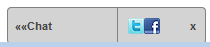
width_prop_offsets has been set to “50:50:50″. This inceases the width of the infobox, buttons section, and minimized toolbar by 50 pixels each. Here is a picture of what the toolbar now looks like in the minimized state:
Widget styling
Next, let’s change the styling of the widget by altering the widget section of the quickstyling code as follows
widget:{
	background_css:"background-color:#666666;border:4px solid lightblue;",
	width_prop_offsets:"0:0:0", //title : buttons : info box
	height_offset:0,
	text_top_offset:0,
	height_prop_offsets:"50:50:50", //title : buttons : info box
	width_offset:50,
	logo_top_offset:0,
	logo_left_offset:0,
	logo_css:"display:none;",
	title_css:"left:10px;",
	full_page_button_css:"",
	off_button_css:"",
	infobox_css:"",
	base_font_css:"color:white;",
	title_font_css:"color:white;",
	alert_css:"color:pink;",
	link_css:"color:white;",
	link_hover_css:"color:yellow;",
	link_disabled_css:"color:#dddddd;",
	info_css:"color:lightblue;"
},
The result:
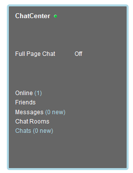
Explanation:
The background_css property is used to change the widget’s color and border.
The widget was widened by setting width_offset:50,
The color of text has been changed. The default color is now white. Text which displays info about the state of the chat is lightblue. We have only changed the color in this example, but you may change the size, font, and other properties of the text as well.
height_prop_offsets has been set to “50:50:50″. This inceases the height of the title, buttons, and infobox section by 50 pixels each. If the widget was configured for a horizontal layout (for instance, when using the template: widget_default_header.js), we would have wanted to change the width_prop_offsets instead.
The image for the logo has been hidden. This was achieved by setting logo_css:”display:none;”,. Also, the title text’s left property has been changed: title_css:”left:10px;”, to compensate for the absence of the logo.
Dialog and application window styling
Next up, we will add a little styling touch to the dialogs and application windows, by editing the dialog/application_window portion of the code. There aren’t a whole lot of options here, so if you need greater control over the styling of these elements, you will have to use one of the other styling methods, mentioned at the beginning of this tutorial. Here’s the code:
dialog:{
        border_css:"border:2px solid purple;",
	title_background_css:"background-color:purple",
	title_css:"color:yellow;",
	link_css:"color:yellow;"
},
application_window:{
	frame_color:"purple",
	title_css:"color:yellow;"
},
The result:
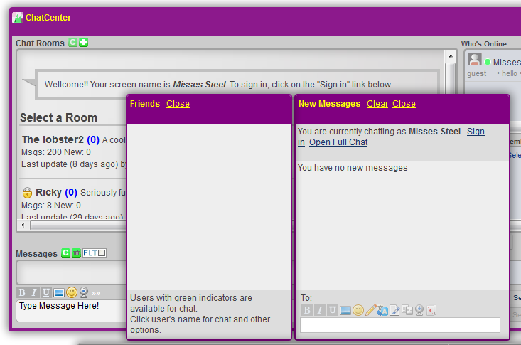
Explanation:
frame_color is a special field, in that it does not take a full CSS property. Instead it takes a single html color or color code.
Styling the full page chat
Finally, you can add some styling touches to the full page chat window by editing the full_page_css_obj field.
full_page_css_obj:{
     "background:color":"green",
     "font":"12px arial"
}
Explanation:
The style properties that you add to full_page_css_obj will be applied to the document body. This basically allows you to change the properties of the page background, and the style of the Welcome/Loading message. Here we are changing the background color of the page to green, and the font to 12px arial.
{“topic”:”Quickstyling”}